The University of Texas / Texas A&M Investment Management Company
Version 2026

UTIMCO Brand Style Guide

Through a visual system that balances institutional strength with approachable confidence, we tell the story of an organization that transforms potential into impact through dedicated stewardship of resources that fuel education, research, and healthcare across Texas and beyond.

This guide outlines the visual and verbal identity of our brand. Guidelines are just that, a guide. Use your best judgment and reference this document as a starting point.

Contents
01Logos & Lockups
02Colors
03Typography
04Visuals
05Applications
06Resources
01

Logos & Lockups

The UTIMCO logo system pairs a diamond keystone icon with the wordmark. The angles within the M and the diamond visually connect when placed together. Use the canonical SVG files — never redraw the mark.
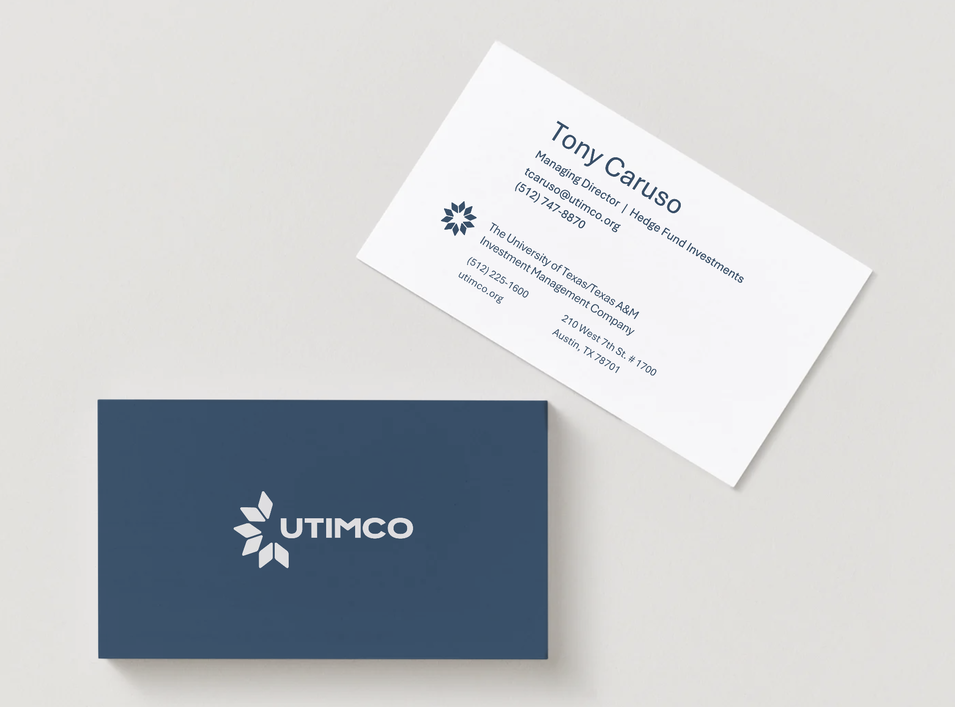
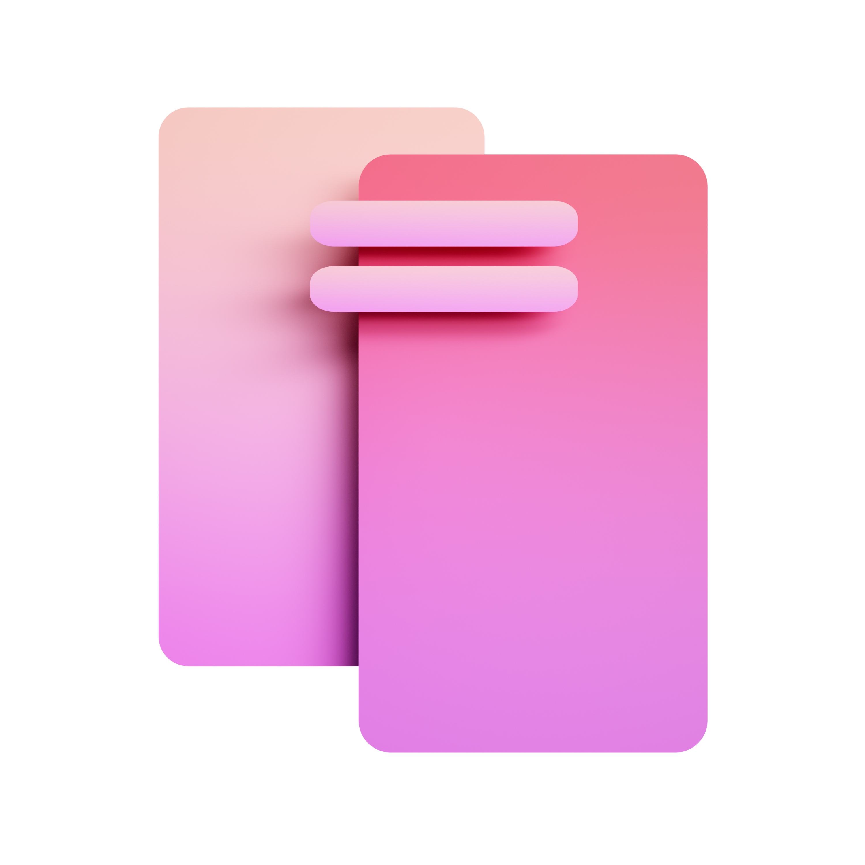
Primary lockup

The default logo for most placements — icon and full wordmark locked into a single unit. Reproduce from the canonical file at any size above the minimums.

Primary Lockup — Dark Background
Default for most placements. Maintain clear space equal to the height of the diamond keystone on all sides.
UTIMCO-IconText.svg
UTIMCO Primary Lockup on light
Primary Lockup — Light Background
Same file, dark background removed. Ensure sufficient contrast on colored surfaces.
UTIMCO-IconText.svg
Icon mark

Square contexts, favicons, and social avatars. Minimum 24px digital, 0.25in print.

Icon Mark — Dark Background
Reversed white mark for dark surfaces.
UTIMCO-Icon.svg
UTIMCO Icon Mark on light
Icon Mark — Light Background
Native mark for light surfaces.
UTIMCO-Icon.svg
Wordmark variants

Use a standalone wordmark when the icon would compete with surrounding content, or where a single delicate or oversized lockup reads better.

Wordmark Bold
Use when the icon would compete with content.
UTIMCO-Bold.svg
Wordmark Light
Alternate weight for delicate or large display use.
UTIMCO-Light.svg
Institutional descriptors

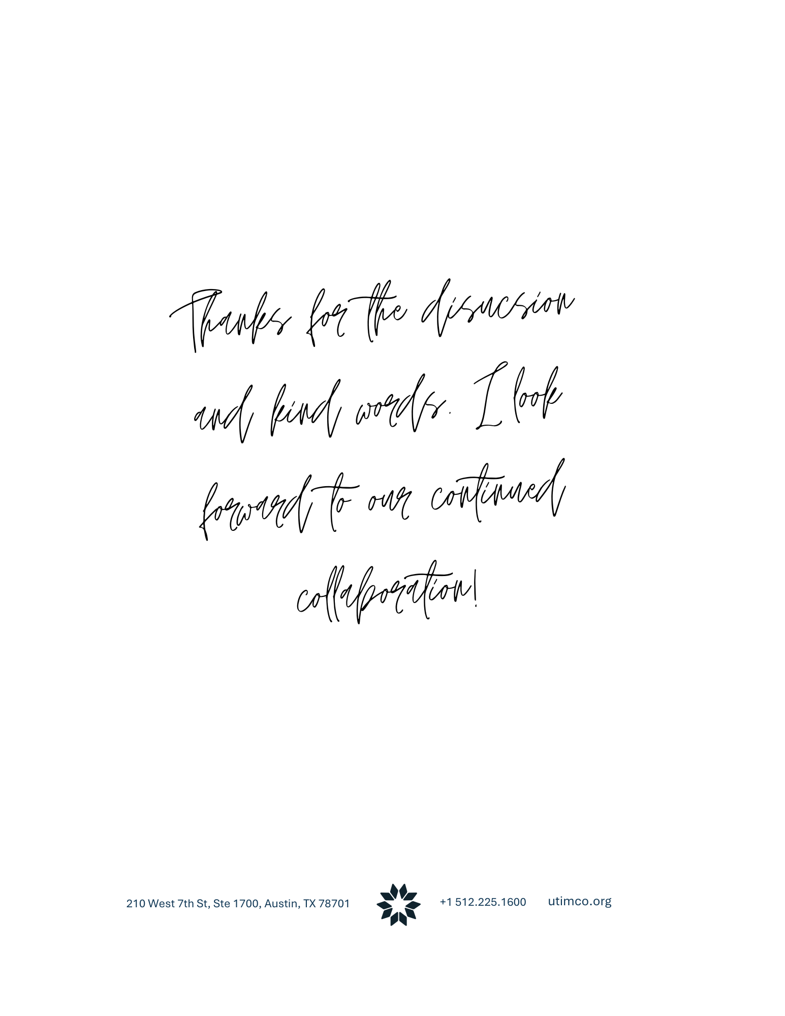
The full institutional name set as a typographic lockup, for footers, banners, and tight vertical placements.

Institutional Text Line
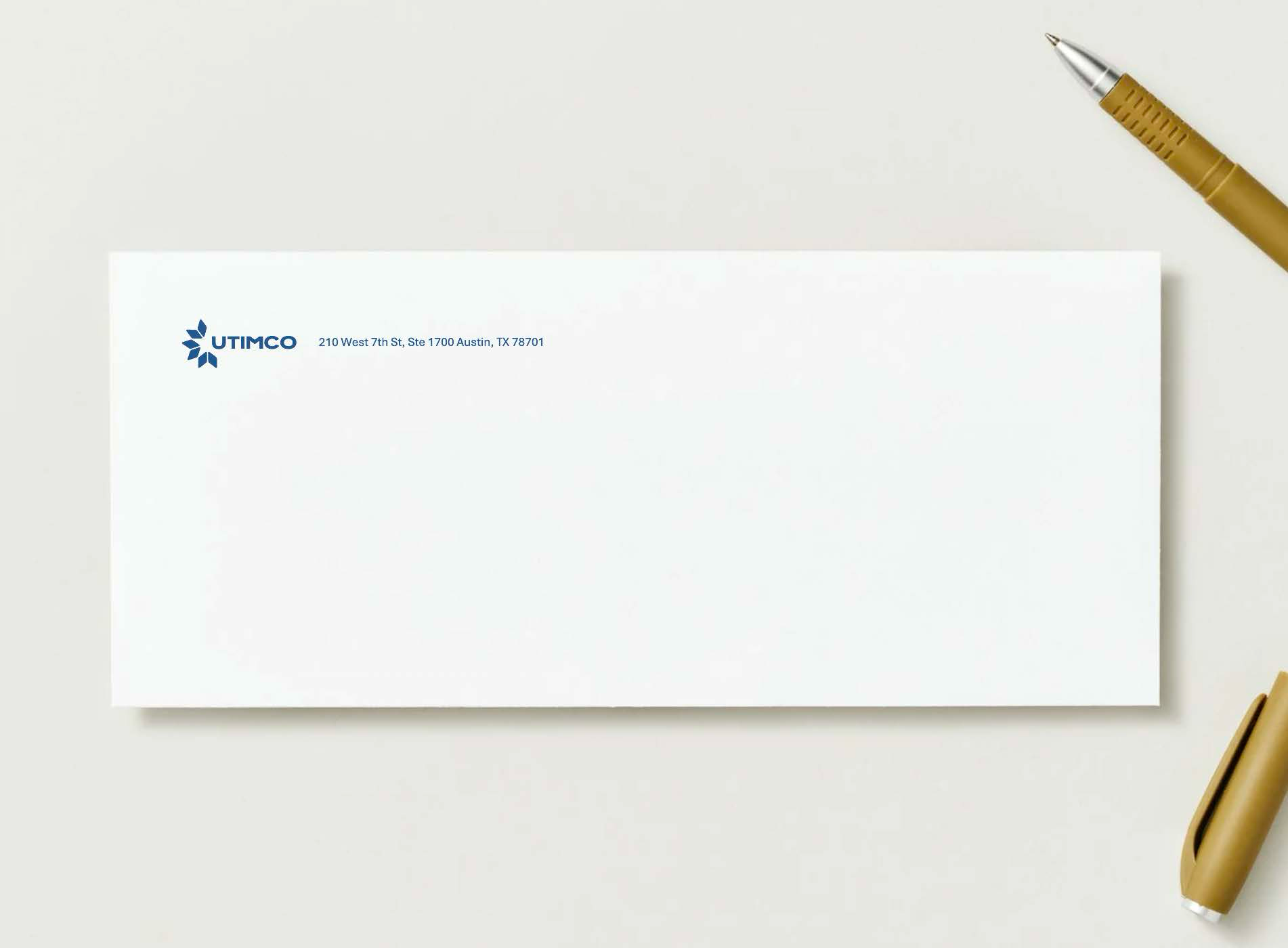
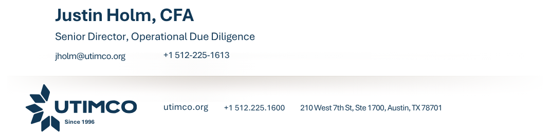
Institutional Name — Horizontal
Letterhead footers and wide lockups.
TextLine.svg
Institutional Text Stacked
Institutional Name — Stacked
Tight vertical placements.
TextLine-Stacked.svg
Institutional Text Side
Institutional Name — Side
Wide footer or banner contexts.
TextLine-Side.svg
Anniversary marks
2026 only

The 30-year seal marks the anniversary year. Retire after 2026.

30 Year Seal Light Background
30 Year Seal — Light Background
Anniversary use on light backgrounds.
30YearSeal-LightBgrounds.svg
30 Year Seal — Dark Background
Anniversary use on dark backgrounds.
30YearSeal-DarkBgrounds.svg
Logo misuse
  • Stretch or distort the mark
  • Recolor outside the approved palette
  • Add drop shadows or strokes
  • Place on a busy photograph without the masked variant
  • Place text or graphics inside the clear space zone (minimum = height of diamond keystone)
Minimum sizes
Primary lockup — 120px / 1.0 in
Icon mark — 24px / 0.25 in
Below these sizes, switch to the wordmark or increase placement.
02

Colors

The palette below is the authoritative reference.

Brand colors

Five core colors carry the identity. Dark Blue anchors; Aqua and Dark Teal add depth; Green is a light-surface accent.

Dark Blue
HEX#113856
PMS295 C
Default body text. Primary dark background. Strongest pair: White, Gray 100.
Mid Blue
HEX#0D5172
PMS301 C
Primary accent and link color.
Aqua
HEX#3D97B5
PMS7459 C
Accent, stat highlights, bottom bands. Pairs with Dark Blue or Dark Teal.
Dark Teal
HEX#004D59
PMS3165 C
Secondary accent for charts, tags, program-specific use.
Green
HEX#98B8AD
PMS623 C
Accent on light surfaces. Reads weakly on Aqua or Mid Blue — avoid.
Neutrals

A simple grayscale for backgrounds, dividers, and surfaces. Avoid pure Black for body text — use Dark Blue.

White
HEX#FFFFFF
Default page background.
Gray 100
HEX#EFEFEF
PMS5% black
Section backgrounds, image placeholders.
Gray 200
HEX#E2E2E2
PMSCool Gray 1 C
Dividers, hairline borders.
Gray 300
HEX#CDCDCD
PMSCool Gray 3 C
Button strokes, secondary surfaces.
Black
HEX#000000
PMSProcess black
Avoid for body text — use Dark Blue instead.
Institutional colors
Reserved

Reserved for content that explicitly references the universities. Never decorative, and never adjacent to one another.

UT Burnt Orange
HEX#BF5700
PMS159 C
For content referencing UT Austin only. Not decorative.
A&M Maroon
HEX#500000
PMS202 C
For content referencing Texas A&M only. Never next to Burnt Orange.
Pairing rules
  • Dark Blue pairs strongest with White and Gray 100.
  • Aqua pairs with Dark Blue or Dark Teal for depth.
  • Green works as an accent on light surfaces but reads weakly on Aqua or Mid Blue.
  • Never place UT Burnt Orange next to A&M Maroon. They compete and read as brand confusion.
  • Always meet WCAG AA contrast — 4.5:1 for body text, 3:1 for large text.
03

Typography

The full Aptos family is approved. Aptos Display carries hero headlines and section openers. Aptos Serif Italic is reserved for pull quotes. Aptos Narrow is for tight columns and data labels only.

Type scale

A single scale from display to caption. Lead with weight before size when space is tight.

RoleSpecimen
Display XL
Aptos Display Bold · 132/116 · -3% · cover title
Legacy
Display L
Aptos Display Bold · 80/88 · -1%
Endowment
H1
Aptos Display SemiBold · 56/64
Investment Management
H2
Aptos SemiBold · 40/48
Section heading
H3
Aptos SemiBold · 30/36
Subsection heading
H4
Aptos SemiBold · 22/28
Card or sidebar heading
Body Large
Aptos Regular · 24/32
Intro paragraph or lead text for longer reads.
Body
Aptos Regular · 20/28
Default body text across all communications.
Body Small
Aptos Regular · 18/25
Supporting copy, sidebars, secondary labels.
Caption
Aptos Regular · 11/14 · +1%
Image caption or attribution line for charts and figures.
Eyebrow
Aptos SemiBold · 16/20 · +8% · CAPS
Investment Strategy
Pull Quote
Aptos Serif Italic · 24/32
"Transforming potential into impact."
Mono
Aptos Mono · 13/18
color/brand/dark-blue = #113856
Narrow
Aptos Narrow · 14/19
Sidebar label / infographic data
Hierarchy rules
  • Always create a clear difference between adjacent levels. If two consecutive levels look similar, drop one.
  • Lead with weight before size when contrast is needed in tight space.
  • Use Aptos Light only at large display sizes (40pt and up) where its delicacy reads.
  • Aptos Narrow is reserved for sidebar labels, infographic data, and tight columns. Not for body copy.
  • Aptos Serif Italic carries pull quotes only. Do not use it for body or running headers.
Live specimen

Type set on a dark surface — the most common reversed application.

Investment Management Company

Transforming
potential into
impact.

Through disciplined stewardship of endowment assets, UTIMCO supports the educational, research, and healthcare missions of The University of Texas and Texas A&M University Systems.

"We invest in futures, not just funds."
04

Visuals

The diamond keystone is the visual engine of the identity. Decorative diamond forms extend the icon into backgrounds, dividers, and accents. Use at reduced opacity — never as a standalone logo substitute.

Diamond elements

Six approved decorative forms derived from the keystone, for layered backgrounds and structural dividers.

Flat Diamond
Flat Diamond
Background accent, section corners. Use at 5–15% opacity.
Flat Diamond Horizontal
Wide format banners and headers.
Flat Diamond Horizontal Square
Square social tile backgrounds.
Split Diamond
Split Diamond
Structural divider — suggests motion and forward progress.
Diamond Split Highlight
Layered with Split Diamond for depth. Use Aqua / Dark Teal pairings.
Diamond Split Pair
Diamond Split Pair
Full decorative element — high-impact covers and presentations.
Imagery direction

Photography reinforces four content areas. Real people, real outcomes — avoid generic stock. Aim for authentic institutional photography with natural light and a measured, unhurried editorial quality.

01
Institutional Excellence
University campuses, landmark buildings, graduation ceremonies — signals legacy and credibility.
02
Human Impact
Students, researchers, patients, and professionals benefiting from UTIMCO stewardship.
03
Financial Precision
Data visualization, investment meetings, strategic planning. Controlled, clean environments.
04
Texas Identity
Landscapes, cityscapes, campus life connecting to the geographic mission of both university systems.
05

Applications

The system scales from a single social tile to a multi-page annual report. These are the common output formats with their grid and color-treatment defaults.

Social & print

Recipe-driven layouts keep output consistent across channels.

Social Tile — Recipe A
1080×1080 · White ground, Dark Blue type, Aqua bottom band. Safe zone: 80px all sides.
Social Tile — Recipe B
1080×1080 · Dark Blue ground, White type, Dark Teal bottom band.
One-pager (US Letter)
6-col grid, 0.5in margins. Header band → Hero → Body → Data stats → Footer with hairline rule.
Jordan Reynolds
Managing Director, Public Equity
T: (512) 225-1600
jreynolds@utimco.org
utimco.org
The University of Texas /
Texas A&M Investment
Management Company
Email Signature
Inline logo lockup, Dark Blue name, Mid Blue title. No decorative color — institutional and clean.
Color treatment

Four default ground / type pairings for backgrounds and bands.

White / Dark Blue
Dark Blue / White
Aqua / White
Dark Teal / White
06

Resources

Source files for logos, fonts, and reference documents. All paths are relative to the UTIMCO project root.

Source files
SVG Logos
assets/icons/

18 canonical SVG files — primary lockup, wordmarks, institutional descriptors, anniversary seals, and decorative diamond elements.

Aptos Font Family
assets/fonts/

Full Aptos family: Display, Narrow, Serif, Mono, and core Aptos in all weights and styles.

Authoritative reference for colors (hex, RGB, CMYK, PMS), type scale, logo specs, spacing grid, and radii.

Values, aspirational statements, tone guidelines, and writing rules. Read before producing any copy.

Grid specs, structure, and color treatment defaults for one-pagers, social tiles, wireframes, letterhead, and presentations.

Four imagery pillars, search clusters, photo style, and selection criteria for all UTIMCO communications.

Client-approved brand guide. The canonical record — do not edit this file.

PPT Presentation Template
Templates/PPT Presentations JDE/

Contractor-delivered approved PowerPoint template. Use this for presentations — do not build slides from scratch.

Current approved email signature layouts and specs.

UTIMCO Brand · 2026